

NAO
Digital
Creative Direction
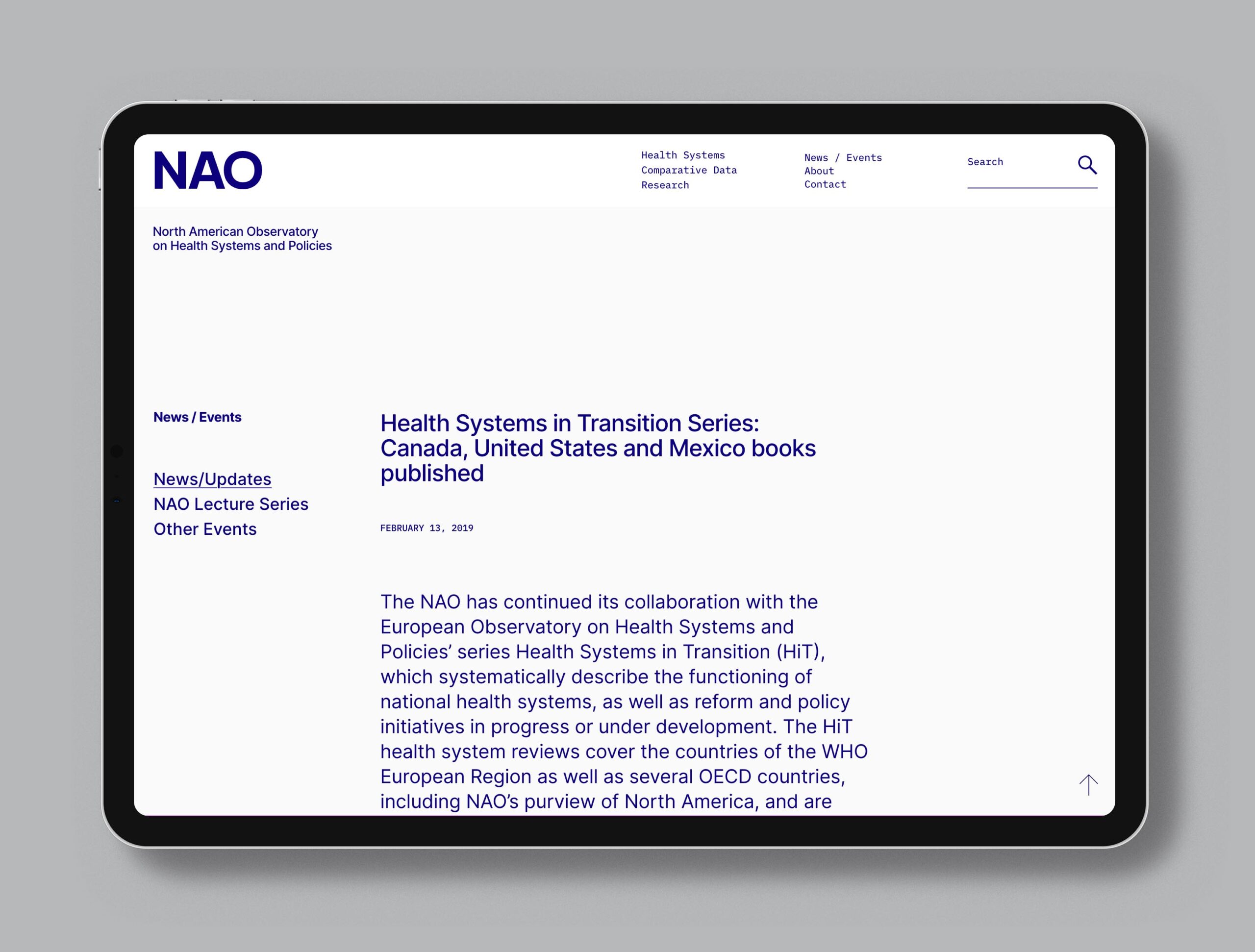
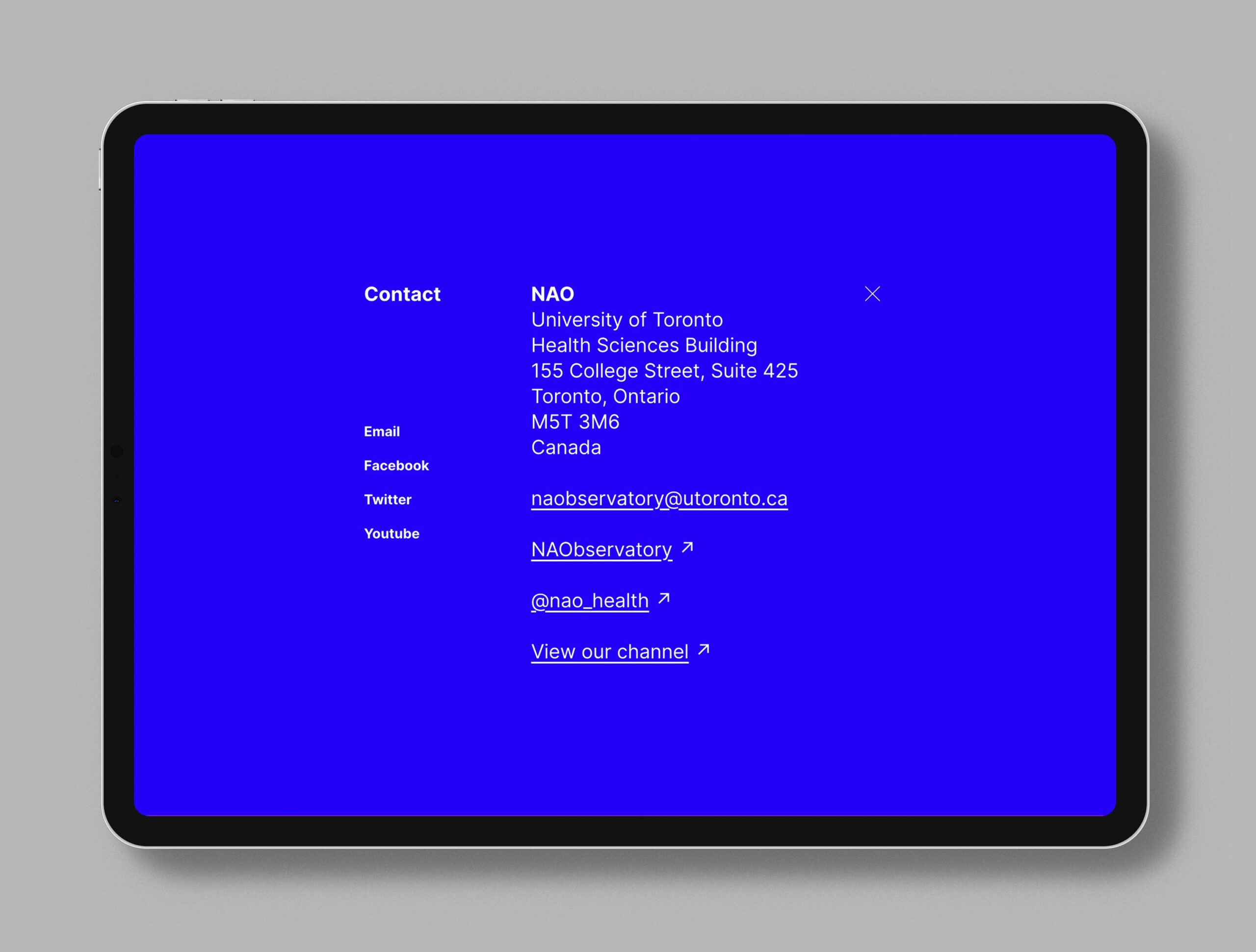
The complexity of the North American Observatory on Health Systems and Policies (NAO) site’s content called for a super straight-forward and easy to navigate design. Inter was used as the main typeface for on-screen readability and clean letterforms.
- Creative directon: r/grainger
- Coding: Premise